Distinguishing all the letters in handwritten math/physics notes
About this post
- Title
- Distinguishing all the letters in handwritten math/physics notes
- Permalink
- https://ulysseszh.github.io/misc/2023/02/04/handwritten-font.html
- Author
- UlyssesZhan <ulysseszhan@gmail.com>
- Date
- 2023-02-04T09:43:02-0800
- Categories
- misc
- Tags
- from zhihu, font, tex, handwriting, long paper
- Abstract
- Personally, I have the demand of handwriting math/physics notes, but an annoying fact about this is that I usually cannot distinguish every letter that may be possibly used well enough. In this article, I will try to settle this problem.
- Cover
-
 (prompts)
- License
- CC-BY-4.0
- View source
- View history
- Comment
This article is adapted from a Chinese article on my Zhihu account. The original article was posted at 2021-02-02 00:41 +0800. There are some minor modifications to the original article as well as some added contents.
Personally, I have the demand of handwriting math/physics notes, but an annoying fact about this is that I usually cannot distinguish every letter that may be possibly used well enough.
In this article, I will try to settle this problem.
This article does not involve calligraphy, and I myself have not learnt calligraphy specially ever.
This article is written also for giving some warn and advice to those who read letters arbitrarily without actually recognizing them and thus even mislead others (unintentionally).
List of different styles
Here is a full list of different styles except for their bold counterparts:
| Style name | command | Example |
|---|---|---|
| Roman | \mathrm |
|
| Italic | \mathit |
|
| Blackboard | \mathbb |
|
| Calligraphic | \mathcal |
|
| Script | \mathscr |
|
| Fraktur | \mathfrak |
|
| Sans-serif | \mathsf |
|
| Typewriter | \mathtt |
We are not going to distinguish all the letters and all the styles.
Some principles
I will try to find a handwriting style that satisfies the following conditions (in descending order of importance):
- I am able to write them fast and simply.
- I am able to recognize each character at a glance.
- The style is consistent for all letters.
- The shape is similar to the default mathematical font of (Computer Modern).
- If the last condition cannot be satisfied, the shape is similar to some style that ever existed.
The reason for the 2nd principle to be lower than the 1st is that the efficiency of taking notes should not be too low and that one may distinguish letters and styles by the context.
If a style fails to satisfy the 5th or the 4th principle (i.e. this style is invented by me), I will add an exclamation mark (!) to inform you of this.
The following lists all the letters and the styles that I want to distinguish:
- Digits: 0, 1, 2, 3, 4, 5, 6, 7, 8, 9 (they are not letters, but they deserve distinguishing).
- Roman style of uppercase English letters: A, B, C, D, E, F, G, H, I, J, K, L, M, N, O, P, Q, R, S, T, U, V, W, X, Y, Z.
- Italic style of uppercase English letters: A, B, C, D, E, F, G, H, I, J, K, L, M, N, P, Q, R, S, T, U, V, W, X, Y, Z (not including O).
- Roman style of lowercase English letters: a, b, c, d, e, f, g, h, i, j, k, l, m, n, o, p, q, r, s, t, u, v, w, x, y, z.
- Italic style of lowercase English letters: a, b, c, d, e, f, g, h, i, j, k, l, m, n, p, q, r, s, t, u, v, w, x, y, z (not including o).
- Roman style of uppercase Greek letters: Gamma, Delta, Theta, Lambda, Xi, Pi, Sigma, Upsilon, Phi, Psi, Omega (not including any letters that cannot be distinguished from english uppercase letters).
- Italic style of lowercase Greek letters: alpha, beta, gamma, delta, epsilon, zeta, eta, theta, iota, kappa, lambda, mu, nu, xi, pi, rho, sigma, tau, upsilon, phi, chi, psi, omega (not including omicron).
- Blackboard bold style of uppercase English letters: A, B, C, D, E, F, G, H, I, J, K, L, M, N, O, P, Q, R, S, T, U, V, W, X, Y, Z.
- Calligraphic style of uppercase English letters: A, B, C, D, E, F, G, H, I, J, K, L, M, N, O, P, Q, R, S, T, U, V, W, X, Y, Z.
- Script style of uppercase English letters: A, B, C, D, E, F, G, H, I, J, K, L, M, N, O, P, Q, R, S, T, U, V, W, X, Y, Z.
- Fraktur style of uppercase English letters: A, B, C, D, E, F, G, H, I, J, K, L, M, N, O, P, Q, R, S, T, U, V, W, X, Y, Z.
- Fraktur style of lowercase English letters: a, b, c, d, e, f, g, h, i, j, k, l, m, n, o, p, q, r, s, t, u, v, w, x, y, z.
In terms of linguistic terminology, each entry in the above list is a grapheme in my handwritten notes. However, in extreme cases, even if I have actively avoided, it is still possible that two graphemes are indistinguishable. Then, I will design allographs for those graphemes to provide extra distinguishability in extreme cases.
Here are some of the general rules that I set up:
- We do not write any serif unless it is a must for distinguishing letters. (This is also why I did not plan to distinguish sans-serif styles.)
- The roman style of all english letters does not have tails (either ornamental or used for ligatures in connected writing).
- For both roman and italic styles, all uppercase letters (both English and Greek) have the same position of bottom and top.
For other details, look at this image:

Roman and italic
A, a, alpha
In italic style, the slanted line in the right side of A is nearly vertical. Actually, in the italic style of uppercase letters, almost all top-left-to-bottom-right slanted lines are nearly vertical.
To write conveniently, use the single-story glyph of a even for its roman style.
The difference of the glyph of alpha and that of a should be noticeable.
C, c, sigma
C and c are tricky because it is very hard to distinguish roman and italic styles for them, but we have to because they are very commonly used. We need to be careful when writing and recognizing them.
Roman style of C is largely vertically symmetrical, while the italic style of C is not. In the italic style of C, the top endpoint of the stroke is to the right of the bottom endpoint, and the left-most position on the stroke is below the center instead of being at the same level as the center.
The opening direction of the roman style of c is to the right, while that of the italic style is to the top-right.
(I once tried using ornamental tails to distinguish the italic style of c from the roman style, but it would make them look strange and may possibly confuse with other letters.)
At first, I did not want to distinguish the roman and italic styles of c, but I found that it is useful to distinguish them. For example, some times we use for indices, so the italic style of c may be used as an index; meanwhile, we may use roman style of c to represent “center” so that we can express the position of the center as . In both cases, the letter c appears in the position of a subscript, but they need to be distinguished from each other.
I want to talk about sigma here because in Greek, its final form looks very similar to c. Just do not use that glyph for sigma.
e
It is important to distinguish the roman and italic styles of e because we may use for the base of natural logarithm and use for the electric charge of a proton.
At the turning point of the stroke at the center-right of the glyph, the roman style of e is sharp while the italic style is round. This detail is enough to distinguish them.
f
The roman style of f is not a descender while the italic style is a descender. Also, the italic style of f has a left-tail in the bottom.
g
To make writing convenient, the roman style of g uses the single-story glyph. It would make it hard to distinguish it from the italic style, but we may write descender of the italic style of g in a exaggerated way to distinguish them.
1, I, l
Here we are at the only extreme case where multiple graphemes share the same glyph: 1, roman style of I, and roman style of l. They are all simply a vertical line.
Normally we should be able to distinguish them by their context, but in some cases we need to distinguish them clearly. We may add some small turnings at the top and bottom of I to distinguish it from l. It is like we are trying to write the serifs of I but we write so fast that they are connected and look like small turnings.
A small sharpe turning may be added at the top of 1 to distinguish it from l.
i, iota
The italic style of i has two tails (one left-tail in the middle and one right-tail in the bottom). It looks exactly the same as iota except for the dot at the top.
K, k, kappa
In both the roman and italic styles of K, the endpoint of the stroke branch of K at the top-right is approximately at the same level as the top endpoint of the vertical line at the left.
The slantation of the left vertical line should be enough to distinguish the italic style of K from the roman style, but we may also add a small tail at the bottom-right to distinguish them further. Do not worry about confusing with kappa because we have other ways to distinguish it.
In the italic style of k, the top-right stroke branch is written as a closed circle. This makes it easier to distinguish from K and kappa.
kappa is shorter than K and k. The bottom-right stroke branch is written in shape of an inclined mirrored S-curve to distinguish from K and k. The endpoint of the stroke branch of kappa at the top-right is approximately at the same level as the top endpoint of the vertical line at the left.
M, mu
In the italic style of M, the bottom is wider than the top, while in the roman style, the top is as wide as the bottom. Write M in four strokes to distinguish it from mu.
As for mu, note that the bottom-left corner is a descender, while other parts are not.
0, O, o
These are the most cursed characters, even more than 1, I, and l. They are so cursed that I refuse to distinguish the roman style of O and o from the italic style, and I would refuse to use the italic style of O and o in my hand written notes.
The digit 0 is narrower than O and o.
Just avoid using omicron because it is indistinguishable from o.
p, rho
Write the italic style of p in two strokes, and it has two left-tails, one at the top-left and one at the bottom-left.
Write rho in one stroke. Starting the stroke from below the baseline (at the bottom of the descender) is recommended.
Q, q
In the italic style of Q, the last stroke looks like a tilde. It is straight for the roman style.
The italic style of q has a sharp right-tail in the bottom.
r, u, v, gamma, nu, Upsilon, upsilon
OK, this is important.
Every physicist must have met at least one person who mistakenly recognized nu as v.
The roman style of r does not have tails (the arc at the top-right does not count as a tail). The italic style of r has a left-tail at the top-left and a right-tail at the top-right. The downward part and the upward part of the stroke overlap at the bottom to distinguish it from v.
The italic style of u has a left-tail at the top-left and a right-tail at the bottom-right. The tail at bottom-right distinguishes it from v.
The italic style of v has a left-tail at the top-left and a left-tail at the top-right. The tail at top-right is ommitable because it is not very noticeable. The bottom of both the roman style and italic style of v is a sharp turning.
The top-left of gamma is curvy while the top-right is straight. The letter is also a descender, so make its bottom lower than the baseline.
The left of nu is a vertical line. The right of nu is like a broken line (!). The left and right parts are tangent to each other at the bottom but separates quickly (!).
Both the top-left and top-right of Upsilon are curvy. It is thus different from r or gamma.
The letter upsilon is not commonly used. If it is used, its bottom is round instead of being sharp, to distinguish it from the italic style of v.
S, s
They are cursed, but not as cursed as O and o.
In the italic style of S and s, the bottom-left is to the left of the top-left. In the roman style, the bottom-left and the top-left are aligned instead.
t, tau
The roman style of t is a straight cross (no curvy strokes) to distinguish it from the italic style.
The horizontal stroke of multiple f’s and t’s may be connected (ligature). Note that they may only be connected if they are intended to form a word. If they are written together just for mathematical multiplication, there should not be a ligature.
The bottom of tau may be either turing to the right or stopping just straightly. I prefer it turning to the right.
U
To distinguish from cup (the symbol for set union), add a vertical line at the right of the glyph (for both the roman and italic styles), but the italic style of it does not have a tail.
W, w, omega
Just like how many people mistakenly recognize nu as v, many people also mistakenly recognize omega as w.
The top-left and top-right of w are the same as those of v for both roman and italic styles.
The letter W is not the same as a upside-down M. For both roman and italic styles, the top of W is wider than the bottom.
There is a right-tail at the top-left of omega. The bottom of omega is round instead of being sharp.
X, x, chi
There are not as many people who mistakenly recognize chi as x as there are for nu and omega, but there are still many.
It is a little hard to distinguish the roman and italic styles of X. First, the top-right-to-bottom-left stroke of X is longer in the italic style to embody the feel of slantation. Also, in the italic style, the top-left of X is to the left of the bottom-left. These should be enough to distinguish it from the roman style. Note that the italic style of X is a little different from the italic styles of other letters in that the top-left-to-bottom-right stroke is not nearly vertical (because otherwise it would look strange).
The italic style of x has a left-tail at the top-left and a right-tail at the bottom-right. The bottom-left and the top-right do not have tails (for convenience). Write x as a cross instead of two C-curves tangent to each other (I know some people write it like that).
The top-left of chi has a left-tail, and the bottom-right has a right-tail. The bottom-left of chi has a right-tail (!), which is the main feature to distinguish it from x. Also, note that chi is a descender, and the intersection of the two strokes is at the baseline.
Y, y
Write Y in three strokes.
Write the roman style of y in two strokes, both of which are straight. The italic style of y is the the same as the italic style of u but the tail at the bottom-right is changed into a descender like that of g.
2, Z, z
Some people add a short stroke in the middle of z (I used to do that) or add a descender at the bottom like that of g to distinguish it from 2. I use neither of them because the sharp turning corner at the top-right of z is enough to distinguish it from 2.
The top and bottom of Z are aligned in the roman style, but the top is a little bit offset to the left of the bottom in the italic style.
The bottom of the italic style of z is written like a tilde.
epsilon
In Greek, there are two glyphs for epsilon, one of which is called the lunate epsilon or the uncial epsilon , and the other does not have a name but I like to call it varepsilon (because the command for the glyph in is \varepsilon).
Use varepsilon. Never use the lunate epsilon because it confuses with the set membership symbol.
Theta, theta
Write Theta as wide as O, and do not make the stroke in the middle touch either side. Tilt theta a bit. Because we do not use italic uppercase Greek letters and roman lowercase Greek letters, Theta and theta should be distinguishable enough.
Lambda, Omega
I have never imagined someone would write Omega that looks very similar to Lambda, but there are people like that. They are very different! OK?
Phi, phi
In Greek, there are two glyphs for phi, the loopy / open one or the stroked / closed one . Just stick to the loopy one and forget about the stroked one so that we can distinguish it from Phi.
Some sources say that we should use the stroked one for the golden ratio. Just forget about that. I never use the letter to represent the golden ratio.
Psi, psi
The tops of the two strokes of Psi are at the same level.
The top of the middle stroke of psi is a little bit higher than the top of the other stroke. There is a left-tail at the top-left of psi. There is a left-tail at the bottom (decender) of psi (!).
Blackboard
We only need to write blackboard style for uppercase English letters. Generally, we just add one or two strokes to the roman style of the letters to make them blackboard style. The general rules are as follows:
- If there are multiple vertical strokes, add a vertical stroke next to each of them, and we are done.
- Otherwise, if there is a non-horizontal stroke that starts from the top-left, add a stroke next to it.
- Otherwise, if the leftmost stroke is a curve that span from top to bottom, at a vertical stroke in the inner, next to the leftmost part of the curve.
- Otherwise, this is a special letter!
There are some special letters as well as some exceptions to the general rules listed below.
A
Add a stroke next to the leftmost stroke.
J
It does not contain a vertical stroke, but we regard the right part of the stroke as one vertical troke.
S
Add two short vertical strokes to the inner of the leftmost part curve and the rightmost part curve.
W
It would be strange if we only add one additional stroke. I want to add two to make it looks like double V (actually, it indeed should be).
Y
Add a stroke next to the to-left stroke and a stroke next to the bottom stroke.
Z
Add a stroke next to the middle part of the stroke.
Calligraphic and script
Different from roman style, some uppercase letters in calligraphic and script styles are descenders. The descenders are: G, J, Q, Y. Some people possibly write F, H (less likely), P, and Z as descenders as well, but I do not.
As for details, I am tired of explaining for each letter. Just look at the image before.
Fraktur
This is the most tricky style. You may think it is hard to write in Fraktur style when you look at how ’s default typeface renders it. Actually, it indeed is, but it is not intended for you to handwrite. I recommend write them as shown here (ignore the final line because we do not need them):
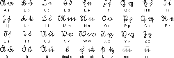
They look very distinguishable.